- 📸 ForegroundWeb Newsletter by Alex Vita
- Posts
- 📸 Your homepage tagline is critical
📸 Your homepage tagline is critical
Plus 3 quick tips on why you should use Google Search Console and my rants on splash pages and personal email addresses.

Alex Vita
July 26, 2023 • Estimated reading time: 16 minutes
You're reading the ForegroundWeb Newsletter, all about photography websites. First time reading? Sign up here.
Happy Tuesday! My new email service almost didn't allow me to include so much info in this message (because of Gmail's 100KB limit), but I managed to include it all. You're welcome.
P.S. Are we connected on LinkedIn? You can link up with me here: Alex Vita.
TODAY AT A GLANCE:
⚡ 3 quick tips: Why you should use Google Search Console, and my rants on splash pages and personal email addresses
🤔 Deep dive: Examples of taglines for your homepage
📊 Chart: How many photographers make their email public?
✍️ Photographer interview with Nicholas Goodden
🔗 Links & Resources: AI tools, freebies & a word on heat waves
🖥️ Website example: Can you find a better "Testimonials" page?
Estimated read time: 7 minutes
Let’s begin:

QUICK TIPS
1. If you’re not using Google Search Console, you’re not serious about your business
Besides Google Analytics, Google Search Console provides the most useful traffic reports you can have. You learn the exact keywords/phrases people are using on Google to find your website (and how many of those impressions turn into clicks).
The Search Results report is definitely the star in GSC:

At the top of the page, you have the 4 main filters: Total Clicks, Total impressions, Average CTR, Average position (in search results).
The “Queries” tab shows you search stats for the main queries people use to find you:
Look for the main phrases that you want to target. For the pages that are performing poorly (low CTR), consider rewriting your SEO meta-description to encourage more clicks. And for pages that have a low position, consider improving the page content.
Look for surprise queries here, phrases that you didn’t expect to be ranked for. Maybe one of your older articles became a little bit “viral”. Take advantage of the “unexpected” organic traffic: use internal links to drive people to other parts of your site, or add a lead magnet to get people to subscribe to your newsletter or social media profiles.
The “Pages” tab lists your top pages, the ones getting the most clicks, or the ones showing the highest in search results, depending on what filters you’ve enabled at the top.
Good pages performing poorly => you need to further improve your content.
So-and-so pages performing well => there’s an interest for that sort of content, and you can expand on it.
The Index coverage report should also be checked from time to time:
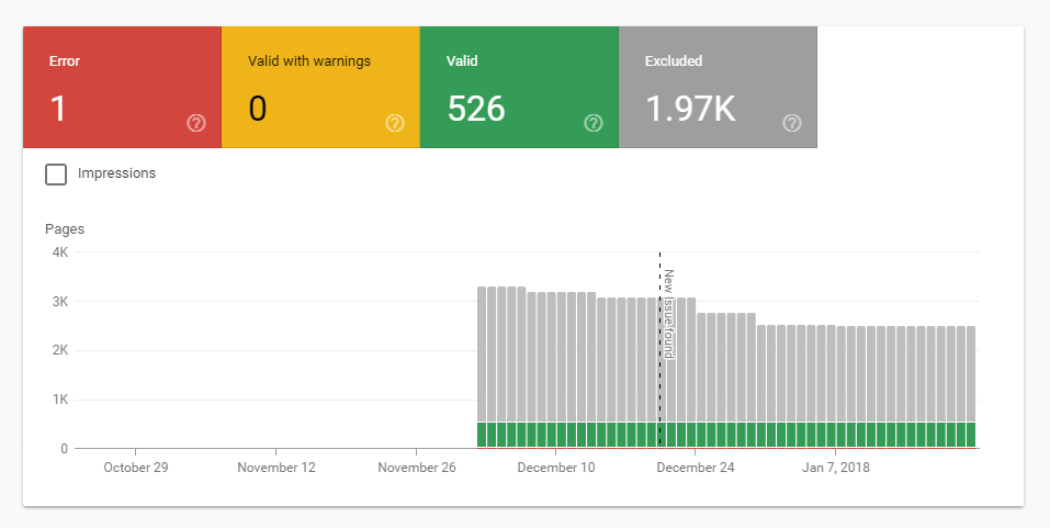
Anything in the “Errors” tab should be addressed promptly.
Items in the “Valid with Warnings” tab should be investigated. Both tabs sometimes throw in “false positives”, ask an SEO expert if you’re not sure. 😉
The graph in the “Valid” tab should just be checked for any sudden drops
The “Excluded” tab provides useful data on why some pages on the site have not been indexed. When that’s intentional, all good. Otherwise, the report will tell you what you need to fix.

Takeaway: Google Search Console has cemented itself as a critically important tool in your online business, not just for SEO purposes, but for your website’s health as a whole.
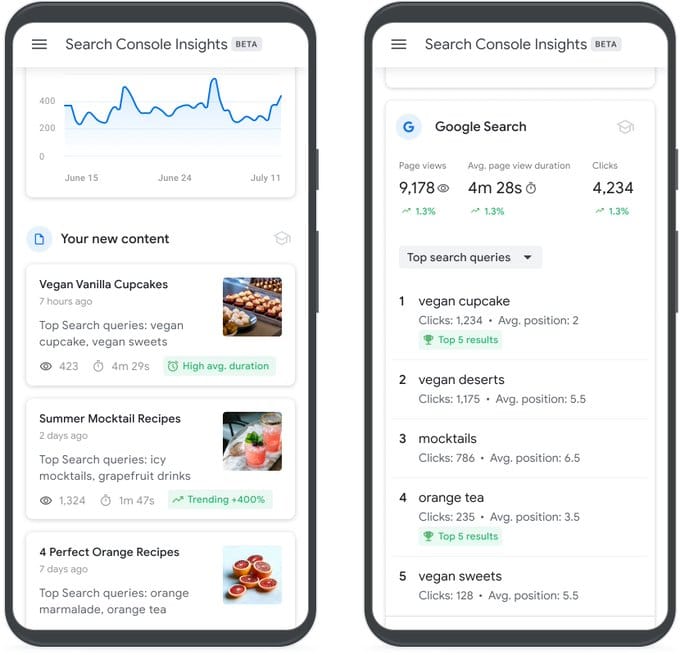
P.S. Also check out Search Console Insights: it combines data from Google Analytics (GA) and Google Search Console (GSC) and allows site owners to better understand how their content is performing in search.
2. Splash pages are bad
You know I hate splash pages, right?
This website takes the cake: https://edneyepics.com/

On the splash page, you can only click on the About and Contact links, and only there can you see the full navigation menu.
Splash pages are awful for UX because they’re blocking access. They’re forcing visitors to see a single image or a slideshow and click a specific button to access the full website. And when people lack options, they sometimes leave.
Websites with splash pages have huge bounce rates, simply because of that lack of browsing freedom for visitors. Sure, they might be “fancy,” and they might include a powerful background image that impresses visitors. Still, they could accomplish the same “visual impact” with the same image at the top of a regular homepage, where the navigation menu is fully accessible from the start.
Allow me to use an analogy: imagine going into a store, but at the entrance, there’s another small room forcing you to look at one single featured product and a door with a sign that says “Enter store.” Wouldn’t that be annoying?